
MAKING MORE SPACE — Simple changes invite readers to pick up your paper
Kevin Slimp
Oct 1, 2023
 draws the reader in with a cleaner, more modern design.")


Younger readers might not know what I'm writing about when I mention Facebook "memories." Still, most of you are familiar with those daily reminders that pop up each morning to remind you of what you were doing one, two, or even 10 years ago. Not long ago, a memory on Facebook reminded me of a post I'd created in 2014: "Over the next three weeks, I'll be speaking in Minneapolis; Sioux Falls, South Dakota; Edmonton, Alberta; Syracuse New York; and Phoenix."
It's hard to imagine I used to spend that much time on the road. It seems like a different lifetime. Don't get me wrong. I still speak at conventions occasionally, but not nearly as frequently as I did a few years ago. These days, I spend as much time redesigning newspapers as anything else. I’m learning that the more papers I redesign, the better I get at finding ways to make the pages draw readers without sacrificing content.
Clients often express concern about losing content at the beginning of the redesign process. One universal goal of redesigns seems to be to get as much text on the pages without increasing page count. Whenever I redesign a paper, I do something to reassure the client. I create an entire issue of the newly designed newspaper using the content from a recent issue.
I’m thrilled to show the publisher, editors and others on staff the issue with bigger headlines, bigger photos and easier-to-read text. For a moment, I feel like a magician.
Unlike any magician you’ve seen, I will share a few of my “tricks” with you.
HEADLINES
Use bigger fonts with fewer words. Instead of “Central High School beats Austin-East to end 6-year losing streak,” I might use “Central ends streak!” in a big, bold font. Underneath, I might include a light subhead (generally in sans serif) describing the headline. I often use the original headline for the subhead:
Bobcats end streak!
Central High School beats Austin-East to end 6-year losing streak
The new headline (and subhead) often takes up no more room than the original headline, yet it appears to fill more space.
PHOTOS
Since the pandemic, I’ve noticed in-person training has become a rarity. I lead a lot of webinars, yet I miss being in person with students. With less training, younger designers often haven’t learned the basic rules many of us learned long ago. One of these is the “shoulder rule.”
The shoulder rule goes like this: Most photos should be cropped to the shoulders. Cropping is one method I use to create more space for bigger headlines and more white space. It’s interesting how a cropped photo might take up less room on the page but appear larger. I often take photos of basketball players shooting a layup surrounded by other players, referees and empty space, cropping it to just the shooter's upper body, tossing the ball with his outstretched arm toward the basket. I’ve heard the response, “That looks much better,” more times than I remember after cropping a photo like this.
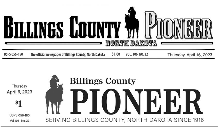
NAMEPLATE/FLAG
My first step in redesigning any newspaper is creating a new flag for the front page. I often spend several days building the new nameplate. A newspaper’s flag is crucial. It either invites someone to look closer at the page or screams at them to throw the paper down.
Interestingly, many nameplates are much larger than they need to be. I think part of the reason for this is that many flags were first designed when bulkier fonts were in style. Newspapers often used multiple lines with “The,” “Press,” and “Chronicle” stacked.
In 2023, clean is in. By placing the flag on one line stretching across the width of the page, the reader is invited to look closer. Updating the flag makes the page more inviting by offering a cleaner, more dignified look.
THE REST OF MY SECRETS
I could go on at the risk of sharing all of my secrets. I’m nearing the end of my allotted space, however, and this should give you and your staff enough material to make some simple yet noticeable improvements to your paper’s design right away.
Kevin Slimp is former director of The University of Tennessee Newspaper Institute and founder of NewspaperAcademy.com. kevin@kevinslimp.com.